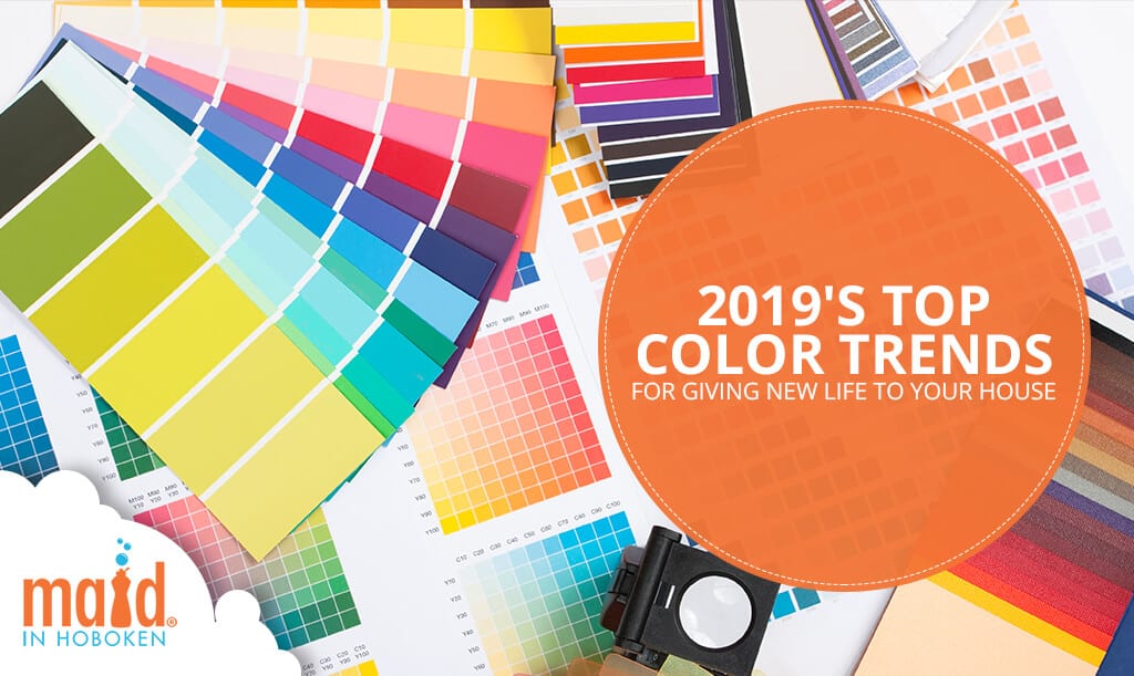
Every wall in your home is a blank canvas, but that doesn’t mean it should stay that way anymore. This year has brought many lovely color trends for painting whole rooms, accent pieces, or even your entire house. This little guide will show you some of the most popular and easily manageable interior color trends for 2019.
Sometimes, all you need to breathe new life into a room is a fresh coat of paint, and with our help, your house might be looking very different in the coming months.
Hazelnut
There’s no better color for creating a comforting ambiance that will get along nicely with your existing furniture than a creamy hazelnut palette.
This tone will brighten up any space, so you have to consider which room in your house needs to catch more light and also appear bigger than it is. We recommend a moderately sized room with plenty of windows or other natural sources of light.
Woodland
Nature has long been an inspiration for interior decorators everywhere, but this year will see a shift from a bright, oversized tropical feeling to a more woodland-oriented set of shades and furniture, giving the spotlight to mushroom grays muted fern-greens.
These earth tones, browns, and grays mostly, will shoot for an old world naturalism that wasn’t so common in years past but will sit right at home with a decor that follows this feel, especially living rooms.
Darker greens
The last time these darker, rich greens were so appealing for interior design was during the 90s. These colors, collectively called 'night watch' by Pantone, can easily transmit a moody, lush evergreen ambiance that's very in synch with nature, provided you use it only for well-lit, already large rooms that won't be affected by the effect of a darker shade of paint.
Also, as with all colors, don't just follow the trend, but consider your current decor is arranged and what will better fit around it.
Pale pinks
A set of shades that will remain popular in 2019 are pale pinks, because of their neutral properties and how readily compatible they are with other shades, such as abundant whites or lemon yellow, giving any space a bright, spacious look.
However, be prepared to change your entire interior arrangement if you're already using dark shades since the clash between those and pale pinks will prove too much.
Muted pastels
Chalky, muted pastel colors bring a soothing effect with them that will be perfect to create a gender-neutral space or common room, including kitchens and bathrooms. Minimalist interior designs will benefit immensely from them because of the warm backdrop they provide.
Changing into a pastel hue will allow you to decorate with a trendy color without committing to colors that are too bold that will tire your eyes in the long run.
Rich muted purple
Ultra Violet was Pantone's Color of the Year pick for 2018, and it seems purple in general will have a lot of staying power in 2019. This year, however, you should expect a more subdued, muted version of it that will nonetheless retain most of its rich energy, but not in such an intense way.
This more "reduced" version will allow it to blend well with other color trends, which are mostly leaning towards understated pastels or muted shades, favoring more minimalistic designs and sparse decorations in tune with a naturalistic outlook.
Pewter
Pewter works like a blank canvas but has a lot more personality as an alternative to just bland walls; its neutrality should not be confused with blandness. For example, expert interior designers suggest adopting a pewter color scheme or ideas throughout your home rather than in just one room, precisely because it works well with anything.
The best part is that you can use it to accentuate almost any color without drowning it in light, like white does, and it's bolder than a beige color scheme.
As we said, 2019’s color trends for your home tend toward the more natural, subdued-yet-strong shades and combinations. Mixing is the name of the game this year, and making sure that you don’t have clashing styles inside your rooms is as basic as ever this time around. Of course, a messy room can clash just as strongly with your decor as two incompatible colors.


